
Input
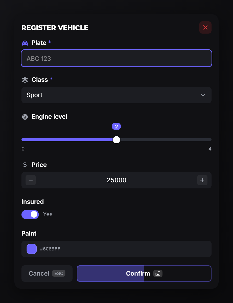
A form dialog with validation. Blocking: it returns the player's answers, so call it from a thread.
input
Two calling shapes are accepted. Use whichever reads better:
-- single table
local values = exports.of_ui:input({ title = ..., options = { ... } })

-- heading, rows, options
local values = exports.of_ui:input('Register vehicle', { ... }, { allowCancel = true })| Field | Type | Description |
|---|---|---|
title | string | Dialog heading. |
options | table[] | The rows. A bare string becomes a text input with that label. |
size | string? | xs, sm, md, lg, xl. |
allowCancel | boolean? | false removes every way out: no cancel button, no ESC. Cancellable by default. cancel is accepted as an alias. |
Returns two values:
local values, byId = exports.of_ui:input(...)values: a positional array, one entry per row, in the order you declared them.nilwhen the player cancelled.byId: a table keyed by theidof each row that declared one.nilwhen no row did.
CreateThread(function()
    local values, byId = exports.of_ui:input('Register vehicle', {
        { type = 'input',  label = 'Plate', icon = 'car', required = true, maxLength = 8, id = 'plate' },
        { type = 'select', label = 'Class', required = true, options = {
            { value = 'compact', label = 'Compact' },
            { value = 'sport',   label = 'Sport', default = true },
        } },
        { type = 'checkbox', label = 'Insured', checked = true },
    }, { allowCancel = true })

    if not values then return end -- cancelled

    print(values[1], values[2], values[3])
    print(byId.plate)             -- same as values[1]
end)
Prefer id over positions once a dialog has more than a handful of rows. Positional indexes shift the moment someone inserts a row; ids do not. Display rows count as positions too: a callout in the middle of your form occupies an index and returns nil there.
closeInput
exports.of_ui:closeInput()Closes the open dialog from code. The waiting input call returns nil.
Field types
Every row needs a type. Rows without one default to input.
| Type | Returns | Notes |
|---|---|---|
input | string | Single-line text. password = true masks it. |
textarea | string | Multi-line. autosize = true grows with the content. |
number | number | Stepper. Honours min, max, step. |
slider | number | Drag between min and max. |
checkbox | boolean | Initial state from checked. |
select | string | One value from options. |
multi-select | string[] | Several values. maxSelectedValues caps how many. |
date | number | Timestamp, or a formatted string with returnString = true. |
date-range | number[] | Two timestamps. |
time | string | format = '12' or '24'. |
color | string | Hex colour. |
Common fields
| Field | Type | Description |
|---|---|---|
label | string | Field label. Required on editable fields. |
description | string? | Muted line under the label. |
placeholder | string? | Shown while empty. |
icon | string? | Icon before the label. |
iconColor | string? | Hex colour for the icon. |
default | any? | Initial value. |
required | boolean? | Blocks confirm while empty. |
disabled | boolean? | Shown but not editable. Text fields stay selectable, so the player can still copy the value. |
id | string? | of_ui: key for this row in the second return value. |
hint | string? | of_ui: help text behind a ? next to the label. |
copy | boolean? | of_ui: adds a copy button that puts the value on the clipboard. |
Validation
| Field | Type | Applies to |
|---|---|---|
min / max | number? | number, slider |
step | number? | number, slider |
minLength / maxLength | number? | input, textarea |
pattern | string? | of_ui: regex the value must match. |
patternError | string? | of_ui: message shown when pattern fails. |
{ type = 'input', label = 'Phone', icon = 'phone', required = true,
  pattern = '^\\d{3}-\\d{4}$', patternError = 'Format: 555-0123',
  placeholder = '555-0123', hint = 'Your in-city number, without the area code.' }
Errors appear once a field has been left, and clear as soon as they are fixed. Confirm stays blocked until every rule passes.
Selects
options is a list of { value, label?, default? }. label falls back to value.
| Field | Type | Description |
|---|---|---|
searchable | boolean? | Adds a filter box. Worth it past ~10 options. |
clearable | boolean? | Lets the player unset the choice. |
maxSelectedValues | number? | multi-select only. |
Display rows
Rows that show content instead of asking for it: callouts, images, markdown, progress bars, stat grids and more. They validate as nothing and return nil at their position.
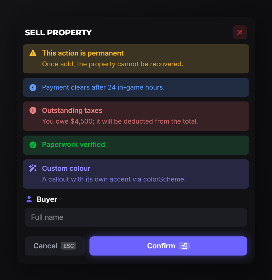
exports.of_ui:input('Sell property', {
    { type = 'callout', variant = 'warning', label = 'This action is permanent',
      description = 'Once sold, the property cannot be recovered.' },
    { type = 'input', label = 'Buyer', icon = 'user', required = true },
})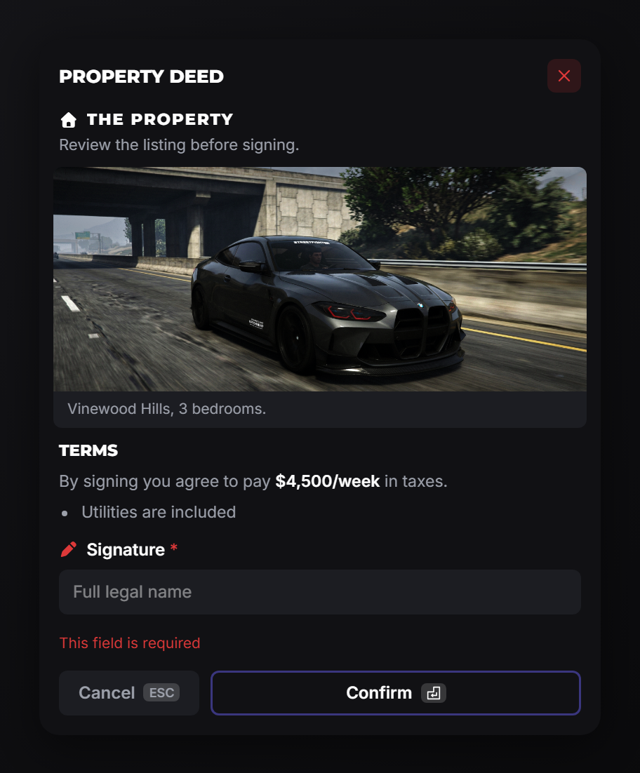
exports.of_ui:input('Property deed', {
    { type = 'title', label = 'The property', icon = 'house',
      description = 'Review the listing before signing.' },
    { type = 'image', src = 'https://example.com/house.png',
      footer = 'Vinewood Hills, 3 bedrooms.' },
    { type = 'markdown', content = '## Terms\nYou agree to pay **$4,500/week** in taxes.' },
    { type = 'input', label = 'Signature', icon = 'pen', required = true },
})
The full list of display rows (and every field each one takes) is on Rows. The same rows work in the drawer.
Notes
- One dialog at a time. A second
inputwhile one is open returnsnilinstead of queuing. - Enter confirms, unless focus is in a textarea or on a button.
allowCancel = falsereally does trap the player. Only use it when your script is guaranteed to close the dialog itself.